7 JavaScript DOM Projects Hiring Managers Actually Like
Updated on February 05, 2026 13 minutes read
Most "beginner" JavaScript projects work fine, but they don’t always prove you can build real UI features. That’s the frustrating gap: you’re learning a lot, yet your portfolio doesn’t clearly show job-ready skills.
This article is for adults changing careers, upskilling for a better role, or preparing for a bootcamp. You’ll get seven JavaScript DOM projects hiring managers respect, plus what to build so each project signals real-world ability.
Why DOM projects still matter in 2026
Frameworks come and go, but the DOM is where the browser becomes an interface. If you can manage state, events, and UI updates with clarity, you’ll ramp up faster in any stack.
Hiring managers also use DOM projects to spot how you think under real constraints. They’re looking for clean behavior, predictable code, and attention to details that users notice.
What hiring managers scan for in your JavaScript projects
A reviewer usually spends a few minutes on your live demo and repo. Your job is to make those minutes feel effortless and convincing.
1) A project that solves a real, human problem
A calculator clone doesn’t tell much about product thinking. A tool that helps someone plan, track, search, or decide tells a stronger story.
2) Strong UI states: loading, empty, error, success
Real apps break, lag, and return weird results. A portfolio app that handles these gracefully looks immediately more professional.
3) Clear state management
Hiring managers want to see where truth lives and how UI stays synced. Even in vanilla JS, your code should read like: state → render → events → state.
4) Practical DOM patterns
Clean event delegation, reusable UI helpers, and minimal re-renders stand out. "Works" is not enough. Maintainable is the real signal.
5) Accessibility and keyboard support
Many applicants skip this, so doing it well is a differentiator. Semantic HTML, labels, focus handling, and good contrast go a long way.
6) A repo that’s easy to review
A good README, sensible file structure, and meaningful commits reduce reviewer effort. Reducing effort is one of the fastest ways to increase your chances.
The "portfolio-ready" baseline for every project
Before you build the next big feature, lock in these basics. They’re what make your project feel like a real product, not a class exercise.
Must-haves (non-negotiable)
Deploy your project so it can be opened in one click. A live demo is often the first thing a reviewer checks.
Write a README that explains what the project does and why it exists. Include setup steps, screenshots, and a short feature list. Make it responsive so the UI works on mobile and desktop. Hiring managers will test it on different screen sizes.
Strong signals that make you stand out
Add meaningful empty states that guide the user. For example: "No results. Try clearing filters" is better than a blank page.
Handle errors like a product would. Show what went wrong, and give a clear way to retry or recover. Add accessibility basics: labels, keyboard navigation, and visible focus states. If you build modals, manage focus, and allow Escape to close.
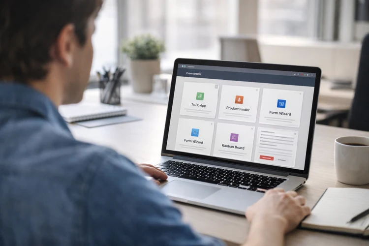
1) Smart To-Do App that feels like a real product
A to-do list is common, but a smart one proves you can build real UX. This is a perfect foundation project for a front-end developer portfolio.
What it demonstrates
You’ll show clean DOM manipulation through list rendering and interactions. You’ll also prove you can manage state and keep UI updates consistent. It’s also a great place to show accessibility, because lists and controls are everywhere. Keyboard support and focus behavior can instantly level up the project.
Build it in steps
Start with a minimal add/complete/delete flow. Keep data in an array and re-render the list from that array.
Then add filters like All / Active / Completed. Make the filter buttons reflect the current state (active styling + ARIA).
Next, add inline editing with Save and Cancel. Use Enter to save and Escape to cancel for a polished experience.
Feature checklist
Persist tasks to localStorage so refresh doesn’t wipe progress. Hiring managers see persistence as a real sign.
Add a clear empty state like "No tasks yet. Add your first one." That small touch makes the UI feel intentional.
Stretch upgrades hiring managers notice
Add an "Undo delete" toast that lasts a few seconds. This shows you can build product-like safety nets. Add drag-and-drop ordering (or up/down controls for accessibility). If you do drag-and-drop, also provide a keyboard-friendly alternative.
Implementation tip
Use event delegation on the list container instead of attaching listeners per item. That keeps your code faster and easier to maintain as the list grows.
2) Weather + Air Quality Dashboard with caching and UX polish
This project looks real because it mirrors production work: search, fetch, display, and fail gracefully. It’s also one of the best JavaScript portfolio projects for showing async handling.
What it demonstrates
You’ll prove you can call APIs, handle rate limits, and show loading states. You’ll also show formatting skills: dates, units, icons, and readable summaries. Caching is a big differentiator here. A simple cache with timestamps shows practical engineering thinking.
Build it in steps
Start with a city search input and a "Get Weather" button. Display current temperature, condition, and a simple icon. Next, add a 3–7 day forecast view. Keep the layout consistent and readable on mobile.
Then add an air quality summary if your chosen API supports it. Even a basic AQI label with a short explanation adds credibility.
Feature checklist
Add loading UI while requests are in progress. Skeleton cards or a simple spinner are both acceptable if they’re clear. Add error UI for "city not found" and "network error." Also, handle empty input with friendly validation.
Cache the last successful result in localStorage with a timestamp. If a user refreshes, show cached results with "Last updated: …".
Stretch upgrades that stand out
Add a unit toggle (°C/°F) and remember the preference. This shows you can manage user settings cleanly. Add "Use my location" with the Geolocation API. Handle permissions and fallback clearly if the user declines.
Implementation tip
Keep formatting logic in small utilities like formatTemp() and formatDate(). This makes your code testable and keeps the rendering functions clean.
3) Personal Budget Tracker with categories and monthly insights
A budget tracker is a high-signal project because it’s practical and relatable. It also lets you show real-world UI: forms, tables, filters, and summaries.
What it demonstrates
You’ll show form handling, validation, and derived calculations. Those are core skills for front-end work in almost any industry. You’ll also demonstrate how you structure data and compute insights. That’s valuable whether you’re going into web dev, product, or even data-adjacent roles.
Build it in steps
Start with a form to add transactions: income or expense, amount, date, category, and note. Store each transaction as an object with an id. Then render a transaction list with totals at the top. Keep "Total income," "Total expenses," and "Net" visible. Next, add category summaries for the current month. A simple bar visualization using CSS can be enough to show patterns.
Feature checklist
Validate amounts and dates with clear inline messages. Avoid vague errors. Tell users exactly what to fix. Allow filtering by month and category. This is a good place to add a dropdown and a quick search box.
Persist everything to localStorage so the tracker remains useful. A genuinely useful portfolio project is easier to talk about in interviews.
Stretch upgrades hiring managers like
Add a monthly comparison insight like "Food spending up 12% vs last month." This shows you can work with derived data and simple analytics. Add export to CSV so users can download their transactions. This is a practical feature that many real apps support.
Implementation tip
Compute totals and breakdowns in pure functions. Then keep DOM rendering focused on display, not calculations.
4) E-commerce Product Finder with filters, sorting, and comparison
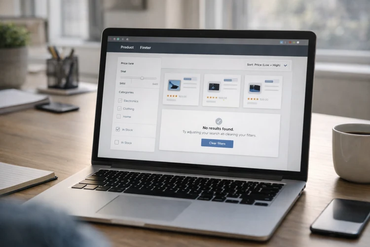
Hiring managers love this because it mirrors real front-end tasks. Filtering, sorting, and list rendering show you can build app-like behavior.
What it demonstrates
You’ll show confident state management across multiple UI controls. You’ll also show performance awareness when lists grow. This project is a great demo of business logic meeting UI. It’s the kind of feature set companies actually pay for.
Build it in steps
Start with product data from a local JSON file. Render cards with image, name, price, rating, and stock status. Add sorting (price, rating) and simple filters (category, in-stock). Make sure the UI reflects the current state and can be reset. Then add a debounced search input. This is a simple performance win and looks mature.
Feature checklist
Show an empty state when no products match filters. Add a "Clear filters" action to help users recover.
Add an accessible product detail modal or drawer. Manage focus properly and allow Escape to close. Implement pagination or "Load more." This prevents huge renders and shows product thinking.
Stretch upgrades that stand out
Add a compare feature that lets users select 2–3 products. Render a comparison table with key attributes. Store filters in the URL query string. This makes the results shareable and looks very real app.
Implementation tip
Render list updates efficiently with DocumentFragment. Avoid rebuilding the entire DOM if only the sort order changes.
5) Kanban Board with drag-and-drop and persistence
A Kanban board looks impressive because it’s interactive and state-heavy. If you build it cleanly, it becomes a strong centerpiece in a portfolio.
What it demonstrates
You’ll show advanced event handling and careful UI updates. You’ll also show that you can model complex state transitions. A Kanban board also makes it easy to discuss architecture in interviews. You can explain actions, reducers, and rendering boundaries, even in vanilla JS.
Build it in steps
Start with three columns: To Do, Doing, Done. Allow users to create, edit, and delete cards. Add drag-and-drop between columns. Make sure the UI updates reliably and doesn’t lose cards. Persist the board state to localStorage. On load, rehydrate the state and render the columns.
Feature checklist
Add clear empty states for columns. For example: "No tasks here. Drag one in or create a new card." Add confirmations for destructive actions like delete. Or provide an Undo to show thoughtful UX.
Stretch upgrades hiring managers notice
Add labels like Bug, Feature, Urgent with color chips. Keep it accessible by not relying only on color meaning. Add an activity log like "Moved 'Fix navbar' to Done." This shows you can track actions and display history cleanly.
Implementation tip
Define actions like addCard, moveCard, updateCard, and deleteCard. When your actions are clear, your UI becomes easier to reason about.
6) Multi-Step Form Wizard with real-time validation
Forms are everywhere, and most apps succeed or fail on form UX. A wizard proves you can guide users through complexity without confusion.
What it demonstrates
You’ll show validation strategy, state handling, and focus management. You’ll also show that you can write UI that reduces user errors. Hiring managers often test this project by trying to break it. If your wizard handles edge cases calmly, you stand out fast.
Build it in steps
Pick a realistic flow like onboarding, checkout, or account creation. Split it into 3–5 steps with a visible progress indicator. Validate fields on blur and on submit. Make errors clear and specific, not generic.
Persist progress so refresh doesn’t wipe user input. That’s a small detail that makes the project feel production-minded.
Feature checklist
Make error messages accessible with aria-describedby. Use aria-invalid for invalid inputs and keep labels explicit. Add Back and Next buttons that behave predictably. Disable Next when required fields aren’t valid, but explain why. Include a final review step before submission. This demonstrates thoughtful UX and reduces mistakes.
Stretch upgrades that look professional
Add conditional steps based on earlier answers. This shows you can handle branching logic cleanly. Add a password strength meter and confirm-password matching. Be careful to keep this accessible and understandable.
Implementation tip
Separate validation logic from DOM rendering. A simple validator object keeps rules readable and easy to test.
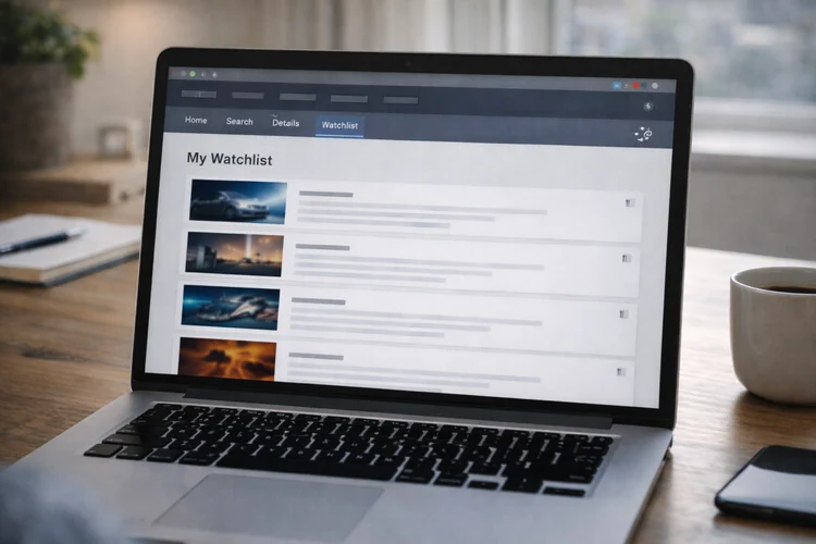
7) Mini Single-Page App with routing and reusable components
This is the most capstone-style DOM project on the list. It proves you can build structure and navigation without relying on a framework.
What it demonstrates
You’ll show module organization, routing, and component-like rendering. That’s a strong signal for junior roles because it shows engineering discipline. It also helps you talk about architecture with confidence. You can explain views, shared layout, and how state flows across routes.
Project concept: Movie Night Planner
Users can search titles, view details, and save a watchlist. This is simple, relatable, and easy to demo in a few clicks.
Build it in steps
Start with hash routing (or History API if you’re comfortable). Add routes for Home, Search, Details, and Watchlist. Build a shared layout with a nav and a main content area. Render views into the main area based on the current route. Add watchlist persistence to localStorage. This keeps the app useful and encourages deeper testing.
Feature checklist
Add loading UI for searches and detail pages. Add error UI for failed requests and empty results. Create reusable UI pieces: card, button, toast, and modal. Reuse is a big signal that you’re thinking beyond one-off code.
Stretch upgrades that stand out
Add shareable watchlists by encoding ids in a URL. This looks advanced without requiring a backend. Add pagination or infinite scroll for search results. Combine this with debouncing to show performance awareness.
Implementation tip
Have each view return a single root element (or HTML string) consistently. Consistency makes your routing and rendering predictable and easy to maintain.
How to choose the right 2–3 projects for your portfolio
More projects aren’t always better. Two polished projects can beat six unfinished ones every time.
If you want front-end roles
Choose the Product Finder and the Multi-Step Form Wizard. They map closely to the work you’ll do on real teams. Add either the Kanban Board or the Mini SPA as your showpiece. That third project demonstrates architecture and interaction depth.
If you’re switching careers and want practical storytelling
Choose the Budget Tracker and Weather Dashboard first. They’re relatable, useful, and easy to explain to non-technical people. Then add the Smart To-Do as a fast win with strong accessibility. It shows fundamentals and polish in a small scope.
How to present these projects so recruiters understand your skills fast
You’re not only building projects. You’re building evidence. Make it easy for a reviewer to see what you did and why it matters.
Write a README that answers real questions
Start with a short "What this app does" paragraph. Then list features, tech used, and how to run it locally. Add a "Key decisions" section with 3–5 bullet points. Mention state approach, performance choices, and accessibility considerations.
Include a quick demo path
Most reviewers won’t explore deeply unless guided. Add a "Try it in 30 seconds" section with steps like: search → filter → save → refresh.
Show your thinking, not just the final UI
Add a small roadmap: what you’d improve next with more time. This signals maturity and helps interviewers start deeper conversations.
How Code Labs Academy can help you build portfolio projects faster
Self-learning can work, but it often lacks feedback loops. You might not know which improvements matter most for hiring outcomes.
In a Code Labs Academy bootcamp, you can practice building job-focused projects with structure. That usually includes mentorship, portfolio guidance, and career support so your work aligns with hiring expectations.
If you want a guided path, you can explore bootcamps, download a syllabus, or talk to an advisor. A short conversation can clarify which program fits your schedule and goals.
Conclusion: build JavaScript DOM projects that signal real readiness
Hiring managers don’t want perfect code. They want strong signals. Projects that handle real UI states, clean state flow, and accessibility are hard to ignore.
Pick one project from this list and build it to portfolio-ready quality. Then add one stretch upgrade that proves depth: caching, routing, compare, undo, or validation polish.
When you’re ready to move faster with structure, feedback, and career support, explore Code Labs Academy programs. Apply when you’re ready to turn your learning into a real tech role.